ClientMax (Website & Conversion Redesign)
Project Overview
ClientMax is an all-in-one sales and marketing platform for small service businesses. They compete against tools like HubSpot, Calendly, and Zapier by bundling everything into one subscription at a fraction of the cost.
This site had a common problem: a great product buried under weak positioning, visual noise, and a CTA strategy that left users with nowhere clear to go.
What Wasn't Working
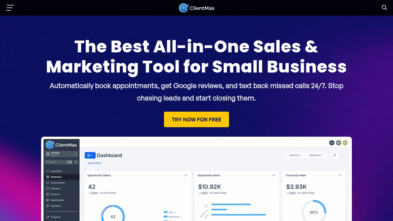
### 1. The headline described the tool, not the outcome
Before:
> "The Best All-in-One Sales & Marketing Tool for Small Business"
This is a category label, not a value proposition. It tells visitors what ClientMax is, not why they should care. Every competitor says something similar. There's nothing here that earns attention.
UX problem: Visitors decide within 3–5 seconds whether to stay or leave. A generic descriptor doesn't give them a reason to stay.
---
### 2. The tagline added friction instead of removing it
Before:
> "Automatically book appointments, get Google reviews, and text back missed calls 24/7. Stop chasing leads and start closing them."
The copy lists features in the first sentence, then pivots to a motivational phrase. The two thoughts don't connect cleanly. "Stop chasing leads" is good — but it's buried at the end of a feature list nobody asked for yet.
UX problem: The tagline is doing two jobs badly instead of one job well.
---
### 3. No social proof above the fold
The original hero had zero trust signals — no star ratings, no review counts, no client logos. For a product asking small business owners to replace multiple subscriptions they already rely on, this is a significant conversion leak. Trust has to be established before the CTA lands.
---
### 4. The comparison table was visually exhausting
The original site listed 15 tools being replaced in a dense table — but it was formatted as plain text rows with no visual weight, no color differentiation, and no clear "winner" column. The savings figure ($1,635/month vs $197/month) was buried at the bottom.
UX problem: The table's core argument — you're wasting money — was invisible. The most important number on the page needed to be the most prominent thing in the section.
---
### 5. Pricing was hard to find and harder to compare
The pricing section had 35+ feature rows listed for both plans with every single one checked. Paradoxically, this made the plans harder to compare, not easier. When everything is included, nothing feels differentiated.
The monthly/yearly toggle was a visual afterthought — "2 Months Free!" was tiny and easy to miss, meaning most visitors would never discover the savings.
---
### 6. No clear CTA architecture
The original page had three different CTAs — "Try Now For Free," "Start for Free," and a nav button — all saying slightly different things, pointing to the same place. There was no hierarchy between primary and secondary actions, and no mid-funnel option for visitors who weren't ready to sign up.
UX problem: When everything is a CTA, nothing is.
---
### 7. No testimonials, no faces, no names
The site claimed "thousands of business owners" use ClientMax but showed no evidence of it. No quotes, no names, no roles. For a B2B product where trust is the primary purchase barrier, this was a major gap.